Here are 8 tips to design a great paywall 🤑
Hi 👋
Some of you might know that for the last 2 years I’ve been working for an app called PhotoRoom.
It’s an image editing app whose business model relies on an in-app subscription.
During these 2 years I’ve witnessed first-hand how having a good paywall is a key factor of success for such an app!
And I’m really happy that I have a the perfect sponsor to talk about this topic this week: RevenueCat 😼
Advertisement
RevenueCat makes adding subscriptions to your app simple🚀
Never worry about StoreKit 🤦♂️📱
Plus, get out-of-the-box charts and reporting for your app 📈📊
Sponsors like RevenueCat really help me grow my content creation, so if you have time please make sure to have a look at what they offer: it’s a direct support to my content creation ☺️
If you’ve never worked on a subscription app before, you might be wondering what a paywall actually is!
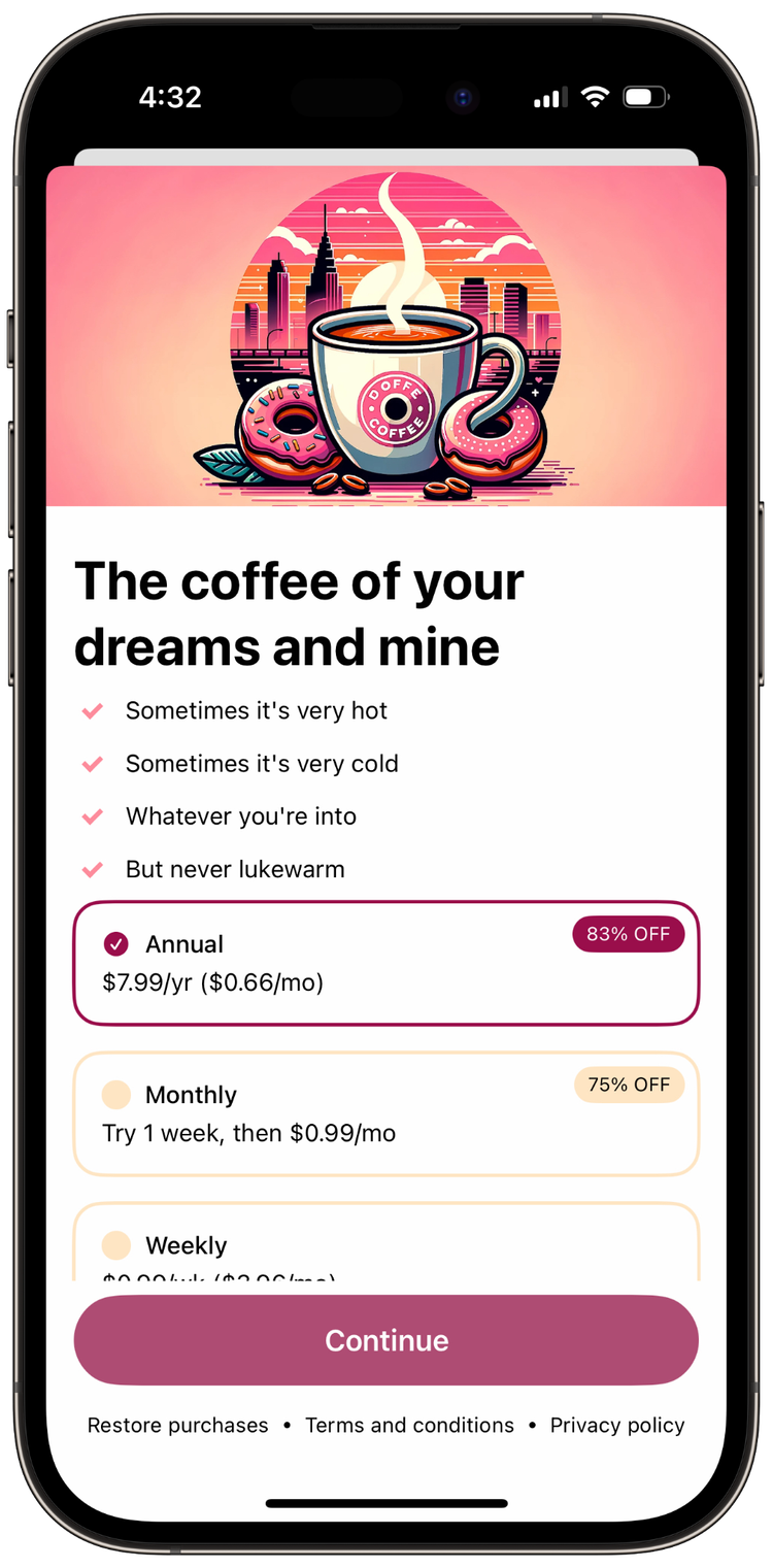
In a nutshell, a paywall is the screen that pitches the benefits of your subscription and allows your user to subscribe to it:
For subscription apps, the paywall is very important because it’s basically the salesperson of the app.
And like any salesperson, it’s responsible for bringing in the revenue!
That’s why such apps spend a lot of time trying to optimize their paywall as best as possible: the better a paywall is, the more revenue it generates.
So let’s go over 8 tips that will help you design a great paywall 🚀
(these tips are based on the video I released last week: you can click on the titles to jump to the relevant part of the video 😌)
Tip #01: Test Everything
If there’s one thing I’ve learned working on paywalls, it’s that there is no best practice that works for everyone.
Every app and every audience are different, so don’t expect to apply some magical “one-size-fits-all” solution.
The only way to really know if you’re on the right track is to experiment a lot and A/B test each change to see what works and what doesn’t.
Tip #02: Highlight Annual Savings Over Monthly
Most paywalls will offer several subscriptions, with different durations: weekly, monthly, yearly, etc.
In this situation, you want to highlight the savings your user will make when they subscribe to a longer plan:
There are several approaches to highlight these savings:
through the percentage of the discount: “83% cheaper”
through the amount of money saved: “save $60”
through the monthly cost: “$7.99/уr (or $0.66/mo)”
And as you can see in the example above, it’s totally possible to use more than one of these at the same time!
Tip #03: Show at the Right Time(s)
It’s basic math: the more you show a paywall, the higher the chances your users will buy something.
Of course, you don’t want to spam your users, but here are some good principles to decide when to show your paywall:
Show early, show often
Show after the “aha”
Show at exciting times for the user
You can even be creative with the form of your paywall!
For instance, indie developer Curtis Herbert came up with the concept of “pay ramps”, which are small in-line paywalls:
Tip #04: Select a Default Package
You want to make it as easy as possible for your users to buy your subscription.
Users should only need to tap the “Buy” button to purchase your subscription.
Any other action should be optional, as making it mandatory is likely to decrease your conversion rate.
For instance, you don’t want to force your users to select one of the plans you’re offering. Instead you want to have one already selected by default:
Tip #05: Choose the Best Call To Action
As developers, we tend to overlook the crucial importance of the text we display to the user.
Because setting a String is very easy to do in code, we tend to focus our attention to more difficult tasks, such as coding beautiful visuals, with nice gradients and animations.
But for our users, it’s the opposite: the text we show them plays a big part in how they experience our app!
That’s particularly true for paywalls, so you really want to experiment to see which copy performs best.
And a great place to start is with the “Call To Action”, meaning the button the user taps to make a purchase.
For instance, there’s a good chance that between these two buttons one will perform better than the other:
Tip #06: Choose the Right Hero Banner
The “hero” is the banner you often see displayed at the top of a paywall.
It’s an important part of the paywall because it helps set a specific mood.
Like everything that’s paywall-related, you really want to experiment to see what kind of images perform the best.
And as you can see, some apps get really creative with their hero banner:
Tip #07: Don't Be Afraid to Heavily Localize
Paywalls are the salespeople of your apps.
And salespeople behave differently depending on the part of the world they’re in.
So it’s unlikely that a same paywall will be a top performer across all the regions where your app is available!
You will need to create specific paywalls that resonate with specific cultures and languages.
User testing is a great way to get feedback from local users: if you already have a an established community of users, don’t hesitate to leverage it!
Tip #08: Build Trust
We’ve all had to deal at one point or another with a scammy subscription that turned out to be a pain to cancel.
You don’t want to give your users the feeling they’re being scammed, so any tactics that helps build trust has the potential to increase conversions.
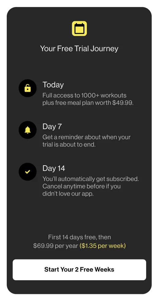
A great example of such a tactic is a paywall that let’s users opt-in for push notifications to remind them of the end of their trial period:
That’s it, these were the 8 tips to design a great paywall that I wanted to share with you this week!
As I said, these tips are based on the video I released last week, check it out if you want to dig deeper into this topic:
That’s all for this email, thanks for reading it!
If you’ve enjoyed it, feel free to forward it
to your friends and colleagues 🙌
I wish you an amazing week!
❤️


